I could have titled this article “How to completely wreck your WordPress sites SEO performance and speed metrics by using the Slider Revolution Responsive WordPress Slider Plugin WYSIWYG Features”, but that would have been a bit long :-)
Even the current title “Optimized Images Load Faster and Consume Less Cellular Data : Lighthouse Report” is a bit on the long side for a title tag…
Or maybe I should have gone with Slider Revolution WordPress Slider Plugin Review.
Google Chrome Lighthouse Audit Reports
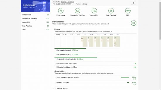
Before I show a Lighthouse Audit Report with major issues, the screenshot below is the Lighthouse Report for this sites homepage, it’s difficult to get 100 out of 100 on all 5 audit tests, my homepage has three 100 out of 100, a 96 out of 100 and a 88 out of 100: these are awesome results.
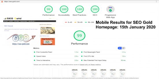
Update 2020: The work to get better SEO performance results never ends, the above screenshot is from February 2018 see the improved Google Lighthouse results below from January 2020.
Troubleshoot Website Performance and Connection Issues
One of my Facebook friends (Patricia Newman a children’s book author : my wife and I have a Children’s Picture Book site) posted on Facebook asking people to check her website to see if they got any connection issues.
Most users reported no issues, but a few had a Forbidden Error.
This sort of user connection data tends to be hit and miss, and doesn’t indicate WHY there might be a problem, fortunately there’s an app (free SEO tools) for that.
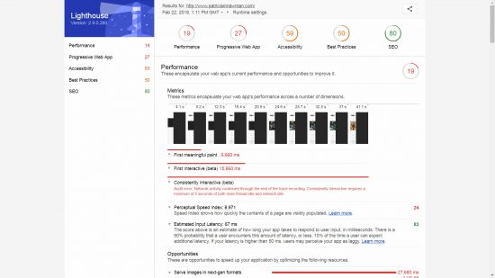
My first step would be check the site out via the Google Chrome Lighthouse tool which gave AWFUL results!
If you aren’t familiar with Lighthouse the above is a particularly bad result. Also see other website speed test tools for different results/issues.
19 for Performance, that’s really BAD and could be a contributing factor to connection problems! Next step would be fix some of the performance issues, see if it fixes the connection problems.
Optimize Images So They Load Faster
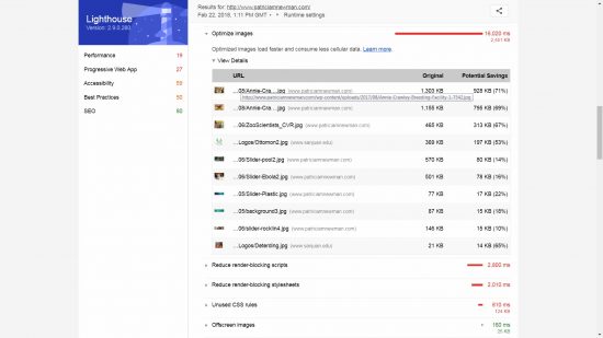
I’ve not performed a full SEO performance audit on the site, just a quick look for the big issues like the Lighthouse reports optimized images load faster and consume less cellular data warning.
The largest image is 1.3MB in size and is associated with a WordPress image slider feature, BUT a quick look through the 6 featured slider posts and I didn’t see that image?
The image slider used is the “Slider Revolution Responsive WordPress Slider Plugin”, in the source code are HTML comments like:
<!-- START REVOLUTION SLIDER 5.4.6.3.1 fullwidth mode -->
Slider Revolution Responsive WordPress Slider Plugin
I wasn’t familiar with the Slider Revolution Responsive WordPress Slider Plugin, but a Google search later I found it for sale for $25 on Code Canyon and it’s had almost 1/4 million sales and apparently powers 2.5 million sites! That’s a lot of users. v5.4.* is the newest version, so any performance issues are with recent versions: it’s February 22nd 2018 as I write this.
From a feature perspective the Slider Revolution Plugin looks advanced (I’ve NOT tested it) with WYSIWYG (what you see is what you get) features** and lots of options.
** Before using image sliders be aware research indicates users don’t click past the first image slide and visitors tend to be banner blind (most users ignore them): have YOU ever clicked through an image slider and visited a link? Also consider we are moving into a mobile first world, is this the sort of JavaScript and image heavy feature a user on a tiny screen with limited bandwidth wants, are there better solutions?
This sort of flashy website feature is what site owners add believing visitors will like their site more. Reality is most visitors ignore the flashy stuff and scroll to the content.
Slider Plugin Images Are NOT Responsive
Anyway, after a little head scratching and searching through the HTML source code I realized the huge image is loaded by the slider plugin as a thumbnail!
This is the relevant HTML source code:
<img src="http://www.patriciamnewman.com/wp-content/uploads/2017/08/Annie-Crawley-Breeding-Facility-1-7542.jpg" alt="Photo credit: Annie Crawley" data-ww="284px" data-hh="189px" width="1600" height="1067" data-no-retina>
Note the HTML image Width is 1600px and the height is 1067px (this is the image size loaded by a browser AND Google), but the slider plugin uses JavaScript to set the width (via data-ww=”284px”) and height (via data-hh=”189px”) to thumbnail sizes: this thumbnail image doesn’t exist, it’s the full 1600px by 1067px image scaled down to 248px by 189px and that’s a huge performance SEO NO!
This is what the image looks like to a visitor on a Desktop PC, the bottom left image is the 1.3MB image loaded in full! Performance SEO wise and usability wise this is AWFUL, that’s not mobile responsive, at least not what mobile responsive means to Google in 2018+.
Patricia’s homepage is loading around 7MBs of images for this slider feature, how is that mobile responsive on a mobile device having to download 7MBs of images for a slider feature! This will have a major impact on pagespeed which will have a major impact on mobile user bounce rates!
Users with JavaScript disabled get a blank space where the slider images would load, there’s no backup feature for those users, this is not a user friendly feature!
Blame the Webmaster or the Plugin Developer?
We could blame the the site owner for not uploading smaller images, but IMO this is a failing in the Slider Revolution Plugin features. The plugin developer should have coded the plugin to create the thumbnail and load the smaller image instead, not load and scale down the full size image!
Remember the plugin is called the “Slider Revolution Responsive WordPress Slider Plugin” (RESPONSIVE indicating mobile responsiveness) and is advertised as optimized for performance.
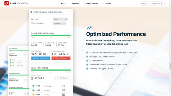
Optimized Performance
Good looks aren’t everything, so we made sure that
Slider Revolution also loads lightning fast!
- Loaded core file size automatically scales with used features
- Intelligent Lazy Loading options
- SEO Optimization
- Monitor and optimize all aspects of your sliders
- Advanced Debugging Options
How to Solve the Optimized Images Load Faster and Consume Less Cellular Data Warning?
Since visitors tend to ignore image sliders the easiest AND best solution is dump the WordPress Slider Plugin and add one header type image in it’s place. It will look almost the same minus the flashy image slider feature.
If this is a must have feature I’d suggest.
1. Limit the number of posts added. Right now it’s 6 posts, would the best 3 featured posts be just as ignorable by visitors?
2. If using the Revolution Slider Layers feature (not used this plugin, but think that’s how multiple images are loaded for one post), limit the number of layers and make sure any images are resized BEFORE uploading them. If you want a 300px wide thumbnail image, upload a 300px wide thumbnail image.
3. Use an Image Optimization plugin like EWWW Image Optimizer which will optimize images uploaded via the WordPress media uploader. A plugin like EWWW won’t create the thumbnails, but at least the large 1600px wide image would have been reduced in size a bit. I optimize images through GIMP before uploading, EWWW is still able to scrape a further 3% to 10% saving on the original image and even more on the different image sizes created by WordPress.
Update 2020: In 2020 I convert jpg images to webp images on the fly via a WordPress plugin (WebP Express) which are even smaller than the best optimized jpgs.
4. Consider using a Lazyload plugin like Rocket LazyLoad: no idea it it’s compatible with the slider plugin, only way to know is to test. I recently updated my WordPress SEO theme (what I use on this site) to work better with the Rocket LazyLoad plugin, now all images are LazyLoaded and Lighthouse gives this site awesome audit results.
5. Use a WordPress caching plugin like W3 Total Cache and set it to have a Browser Cache, minimize and combine CSS/JavaScript files etc…
Good image optimization takes planning starting BEFORE we upload the image via WordPress. Think about what the image will be used for, if an image will ONLY be used as a 300px wide thumbnail or a small 200px wide buy now button, create an image that’s the correct width BEFORE uploading to WordPress.
David Law











Great article on the slider. What was the results of still using the slider but with the added tips at the end if the article? Did it improve your score?
Webmasters tend not to follow my free SEO advice, no idea why.
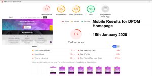
The website in question still has rubbish Google LightHouse results, for Performance it scored 17 out of 100, that’s bad!
This is the direct link to the patriciamnewman.com websites homepage LightHouse results:
https://googlechrome.github.io/lighthouse/viewer/?psiurl=https%3A%2F%2Fwww.patriciamnewman.com%2F&strategy=desktop&category=performance&category=accessibility&category=best-practices&category=seo&category=pwa&utm_source=lh-chrome-extIf you load the URL it will do alive Google Lighthouse test, so you’ll see the current results.
I checked it last in December 2019.
The site has TWO slider plugins active!
LayerSlider 6.9.2 – Multi-Purpose, Responsive, Parallax, Mobile-Friendly Slider Plugin for WordPress.
and
Slider Revolution Plugin 6.1.5 – From simple galleries to landing pages to complete websites: Slider Revolution is the All-In-One WordPress Builder.
It’s really messing up the websites performance score, even when I load the homepage on a Desktop PC it is super SLOWWWWW!
It takes almost 3 seconds to load render-blocking resources, most of that will be js and CSS files related to flashy plugins like those slider plugins.
Slider plugins are a really bad idea performance wise, they should be banned.
David Law
I know this is an older post, but I was googling around about Rev Slider and SEO and came across this. So my question, what about style? It does not seem that style factors into your design scheme very much (I’m not referring to any particular site, just what seems to be your approach); it’s all about SEO. Yes, your website is very fast, but there are plenty of website out there with low to mid-80s performance scores, and the businesses seem to be doing just fine. When I see a beautifully done site, 1) I don’t mind if it’s slightly slower. 2) It makes me feel better about the business.
I look at it basically as a storefront. Most “hole in the wall” establishments are frequented by people because of their reputation, not because of their branding or storefront appearance. But an unknown entity needs to look nicer just to get people in the door, and then they need to have quality products or services. If someone goes to your site, sees it and says, “well this isn’t very nice,” will they then say, “but the site seems to have good SEO, so I’ll go with them”? Or might they keep going through search results looking for that website that gives them a warm fuzzy feeling?
If I’ve heard it once, I’ve heard it a thousand times (especially from women): person 1: “Are they any good?” Person 2: “I don’t know, but they have a nice website.” I’ve never heard: Person 1: “Are they any good?” Person 2: “I don’t know, but their site loaded quickly.”
Thoughts?
Thanks for the info.
Cheers,
Chris