Some WordPress SEO tips on images.
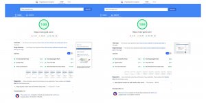
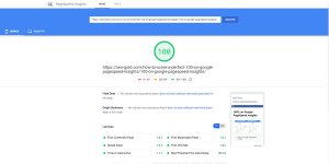
Image dimensions. I find on a WordPress Post/Page it’s best to limit the width of an image to no wider than 550 pixels for performance SEO reasons. If you go bigger than this (especially above 640px wide) you might find the Google PageSpeed Insights tool and Google’s Lighthouse tool complains.
In the Stallion Responsive Theme (used on this site) I’ve added multiple new image sizes, so when I upload a post it automatically creates up to 15 images with various dimensions.
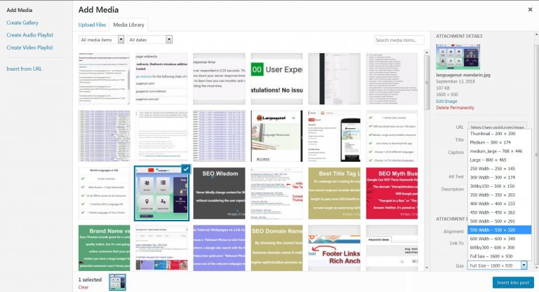
When I upload an image of 1,000+ pixels in width, Stallion Responsive creates 10 images sizes in addition to the 5 images WordPress creates be default: if the image is smaller than 1,000 pixels in width there’s fewer images created (they don’t upscale). When I add the image to a Post or Page via the Add Media button I can choose which dimension to use.
When I uploaded a large image, I’ll tend to show the 550px wide image on the post and have it link to the full image. If the original image is smaller than 550px I tend to just load the full image on the Post/Page and not link to anything.
The main content area of this webpage in Desktop view is around 640 pixels in width, but I tend to add a caption border so limit the actual image to 550px so the images loaded on the page don’t scale down in Desktop view. If your content area is say 500px wide there’s no reason to have the image shown on the page to be larger than 500px, if you need viewers to see a larger image have it open when the smaller image is clicked (like I do).
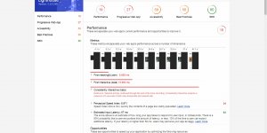
Whoever is adding images to the Languagenut blog posts isn’t taking the size of the viewable content area into account, see screenshot.
Continue Reading Languagenut Review

