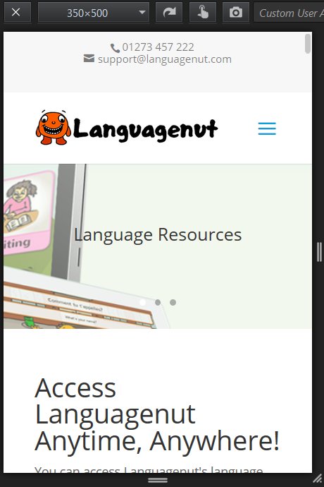
FireFox Responsive Design Mode
FireFox also has a built in mobile device emulator under “Tools” > “Web Developer” > “Responsive Design Mode”.
When in Responsive Design Mode you can see what a webpage will look like in any device size chosen: I really like this browser feature, used to have to use mobile SEO tools to achieve this level of pixel perfect accuracy.
As you can see in the screenshot above the home page of Languagenut looks fine on a mobile device.
I also checked a random selection of webpages under different screen sizes and nothing under WordPress (WordPress Posts, Pages, Categories, Tags) broke under mobile conditions.
Continue Reading Languagenut Review


