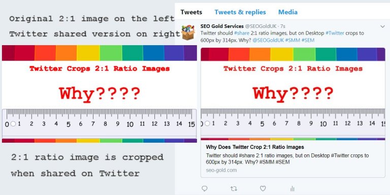
Above is the original image (600px by 300px version on the left) and a screenshot of the Twitter shared image (600px by 314px version on the right) combined together for direct comparison.
Note how the ruler sides have been cropped and the colour bands at the top/bottom are narrower: both are cropped.
This means you have to add additional padding to your Twitter shared images if you want Twitter NOT to crop important parts of the top/bottom and sides of shared images.
Continue Reading Best Twitter Image Dimensions


