I spend a fair amount of time looking at website HTML and CSS code as I do SEO research etc… and occasionally I find a nice website Easter egg: something added by the web designer in the HTML or CSS code which will only be found by those looking directly at the HTML/CSS code.
I’m in the process of creating a new WordPress SEO theme for a new SEO web design service for plumbers and electricians, you can see the work in progress at Plumbers Reviews (a test sub-domain). So I’m browsing through interesting WordPress website designs looking for inspiration and ideas to pinch.
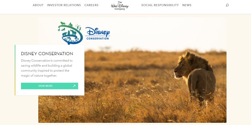
Found my way to the Walt Disney Corporate website at https://thewaltdisneycompany.com/ and liked how the text floats over images, see the example screenshot from the Disney Conservation Fund 2020 news item above.
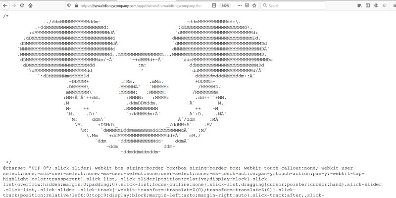
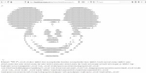
Walt Disney ASCII Art Easter Egg
Since I liked how the text floats over the image and I was considering copying the effect it was a case of digging through the HTML and CSS code. The Walt Disney Company website runs under WordPress and looks like they might use a customised version of a WordPress theme called Boldgrid Hydra: I found similar code within that WordPress theme, though could be they’ve both used the same base theme framework or Page builder plugin. Seems this floating block of text over the image is only used on WordPress Pages suggesting a custom feature added by a Page Builder plugin.
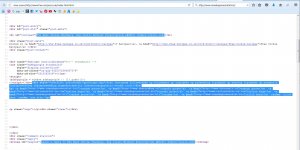
During the hunt for the relevant CSS code for the floating text feature I looked at this CSS file https://thewaltdisneycompany.com/app/themes/thewaltdisneycompany-theme/assets/dist/css/main-19b91b9b8d.min.css which includes the Disney Mickey Mouse ASCII Art CSS Easter Egg.
/*
               ./ddmMMMMMMMMMMddm-                              -ddmMMMMMMMMMMddm\.
           .+ddMMMMMMMMMMMMMMMMMMMMd:                        :ddMMMMMMMMMMMMMMMMMMMMd+.
         :dMMMMMMMMMMMMMMMMMMMMMMMMMMd´                    `dMMMMMMMMMMMMMMMMMMMMMMMMMd:
       .dDMMMMMMMMMMMMMMMMMMMMMMMMMMMMd                    dMMMMMMMMMMMMMMMMMMMMMMMMMMMDd.
      dDMMMMMMMMMMMMMMMMMMMMMMMMMMMMMMd´                  `dMMMMMMMMMMMMMMMMMMMMMMMMMMMMMDd
     `MMMMMMMMMMMMMMMMMMMMMMMMMMMMMMMMd                    dMMMMMMMMMMMMMMMMMMMMMMMMMMMMMMD´
     .MMMMMMMMMMMMMMMMMMMMMMMMMMMMMMMd,.mMMMMMMMMMMMMMMm..,MMMMMMMMMMMMMMMMMMMMMMMMMMMMMMMD.
      dDMMMMMMMMMMMMMMMMMMMMMMMMMdm/-´     `-+dMMMd+-´      `ddmMMMMMMMMMMMMMMMMMMMMMMMMMMDd
       dDMMMMMMMMMMMMMMMMMMMMMdd-              :m:              -ddMMMMMMMMMMMMMMMMMMMMMMDd
        `\dMMMMMMMMMMMMMMMMMMdd                 '                 ddMMMMMMMMMMMMMMMMMMMd/´
            `:dDMMMMMMmddMMMDd                                     ddMMMdmdddMMMMddm+:´
                       -DDMMM+           .mMm.     .mMm.           +DDMMm-
                      .DMMMMM\          .MMMMM´   `MMMMM:          /MMMMMD.
                      mMMMMMMM\         :MMMMM:   :MMMMM:         /MMMMMMMm
                     :MM+´´++dd.         :MMMM:   :MMMM:         .dd++``+MM.
                     .M        `           .ddmDDMddm.           ´        M.
                      M-    ++            .MMMMMMMMMMM             ++    -M
                      `M.    .D+`          `+ddMMMdm+´          ´+D.    .M´
                       `M:     ddm\`                         ´/ddm     :M´
                         \M.     +DDMd\_                 _/ddMM+´    .M/
                           \M:    `dMMMMMDddmmmmmmmmdddMMMMMMMd´   :M/
                             \.Mm   `+ddMMMMMMMMMMMMMMMMMdd+´   mM./
                                `ddm    -ddMMMMMMMMMMdd-    ddm´
                                    -ddm                ddm-
                                         -ddmddmddmddm-

 */
Finding the Easter egg distracted me from my WordPress theme feature hunt, so that was a nice diversion. :-)
SEO Mistakes on the Walt Disney Company Website
If I do copy the floating block of text feature I’ll do it differently for SEO reasons. The Walt Disney version isn’t SEO friendly.
1. The images aren’t named with SEO in mind, this “CHWG_HeroBannerImage-1-960×540.jpg” has ZERO SEO value. This is poor SEO planning by whoever uploads images/content.
2. The images alt text is terrible, this alt=”CHWG_HeroBannerImage-1″ has ZERO SEO value. This is poor SEO planning by whoever uploads images/content.
3. The images should link (be clickable links) to the relevant WordPress Post, so users can click on the images to visit the WordPress Posts. If the alt text is fixed (see 2.) this will add SEO value. This is a WordPress theme feature SEO failing, should be easy to improve.
4. The “View More” anchor text of the text links to the Posts is terrible SEO wise, this adds ZERO SEO value. The links anchor text should include what the Post is about: the Disney Conservation article link should include “Disney Conservation” as the anchor text. This is a WordPress theme feature SEO failing, should be easy to improve.
If I copy this interesting theme feature I’ll fix all those SEO mistakes in my version.
There will be plenty of other SEO mistakes on the Disney Website, for example they put all the Blog Posts in just 2 categorises, Press Releases and News. The News category has over 1,200 WordPress Posts spread over a 50+ deep category making it HARD to browse to old WordPress Posts. This is poor SEO navigation design. To put that into perspective, this website has fewer than 200 WordPress Posts and I’ve spread them over 30 categories so it’s really easy to browse to even the oldest Posts.
I was a little surprised to see the links near the footer had terrible color choices, light green anchor text over a pale yellow background, there’s not enough contrast between those two colors making it difficult to see for users. I’ll be 50 later this year and my eyesight has degraded (I used to have perfect eyesight), I struggled to read the anchor text!
Google warns web designers NOT to do this, see the Google LightHouse Results for the Walt Disney Company HomePage at:
In March 2020 under Accessibility there’s the following Lighthouse warning:
Contrast – These are opportunities to improve the legibility of your content.
Background and foreground colors do not have a sufficient contrast ratio > Low-contrast text is difficult or impossible for many users to read.
Come on Disney’s web designer(s), you can do better than this for your visually impaired visitors, you should be setting the standards!
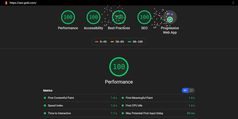
These are typical mistakes of web developers who don’t fully understand SEO. With the money you make from all the Disney films etc… you should be able to pay for an awesome technical SEO expert like me to push your Lighthouse results to the coveted PageSpeed 100 results:
David Law

